Journal
Three Ways to Visualize Curiosity
Project: 3M Latam. Curiosity Bootcamp 2021
Role: Creative Direction & Visual Design
When people think about global brand systems, they often imagine limitations.
Strict guidelines.
Fixed colors.
Approved typefaces.
Little room for interpretation.
But after working on brands of every size, I've found the opposite is often true.
The most interesting design decisions rarely happen outside the system.
They happen inside it.
While developing the visual identity for Curiosity Boot Camp LATAM, an innovation and learning event organized by 3M, I explored three different ways of answering the same question: How do you visualize curiosity?
All three concepts used the same brand framework.
All three respected the same corporate system.
Yet they arrived at completely different answers.
Curiosity as a Person
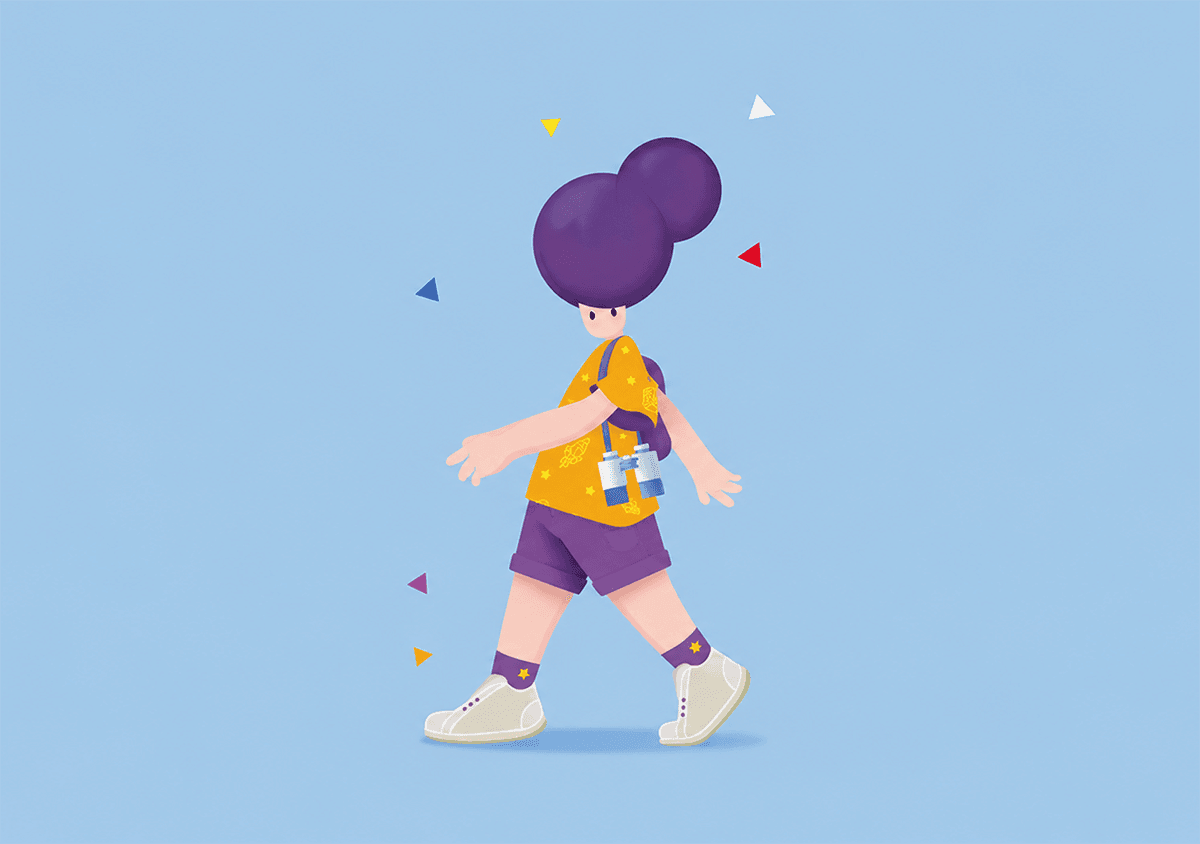
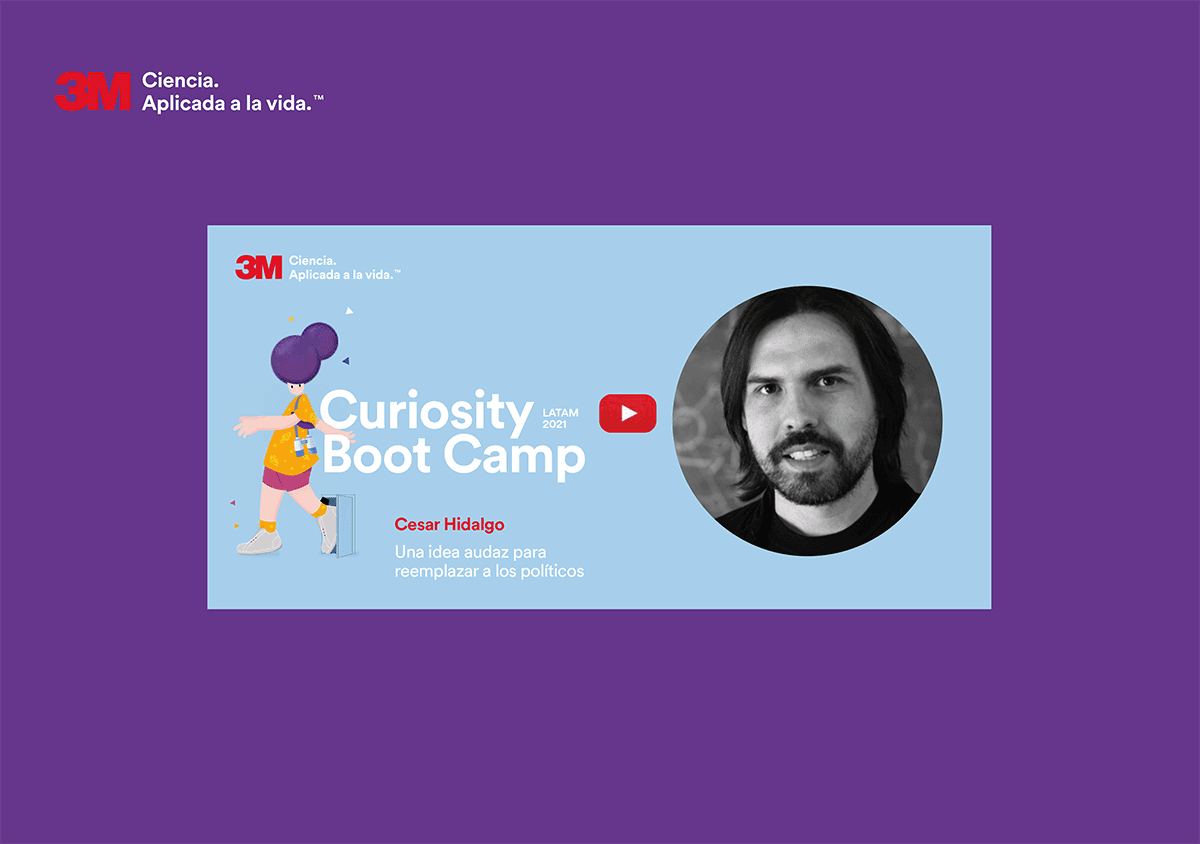
The first direction proposed creating a character.
Since curiosity is a feminine noun in Spanish, the concept started with a female explorer: someone constantly moving toward the unknown.
She carried binoculars, a backpack and a growing collection of experiences gathered along the way.
The character was accompanied by five colored triangles, representing the different areas of curiosity explored during the event while also referencing the 3M visual system. Even the clothing incorporated details borrowed from previous editions of the program.
The goal was to create a visual embodiment of curiosity itself. Someone driven by questions rather than answers. Someone willing to cross boundaries, explore unfamiliar territory and keep moving forward without knowing exactly what comes next.
Rather than functioning as a mascot, the character became the center of a broader visual language built around exploration, discovery and continuous learning.


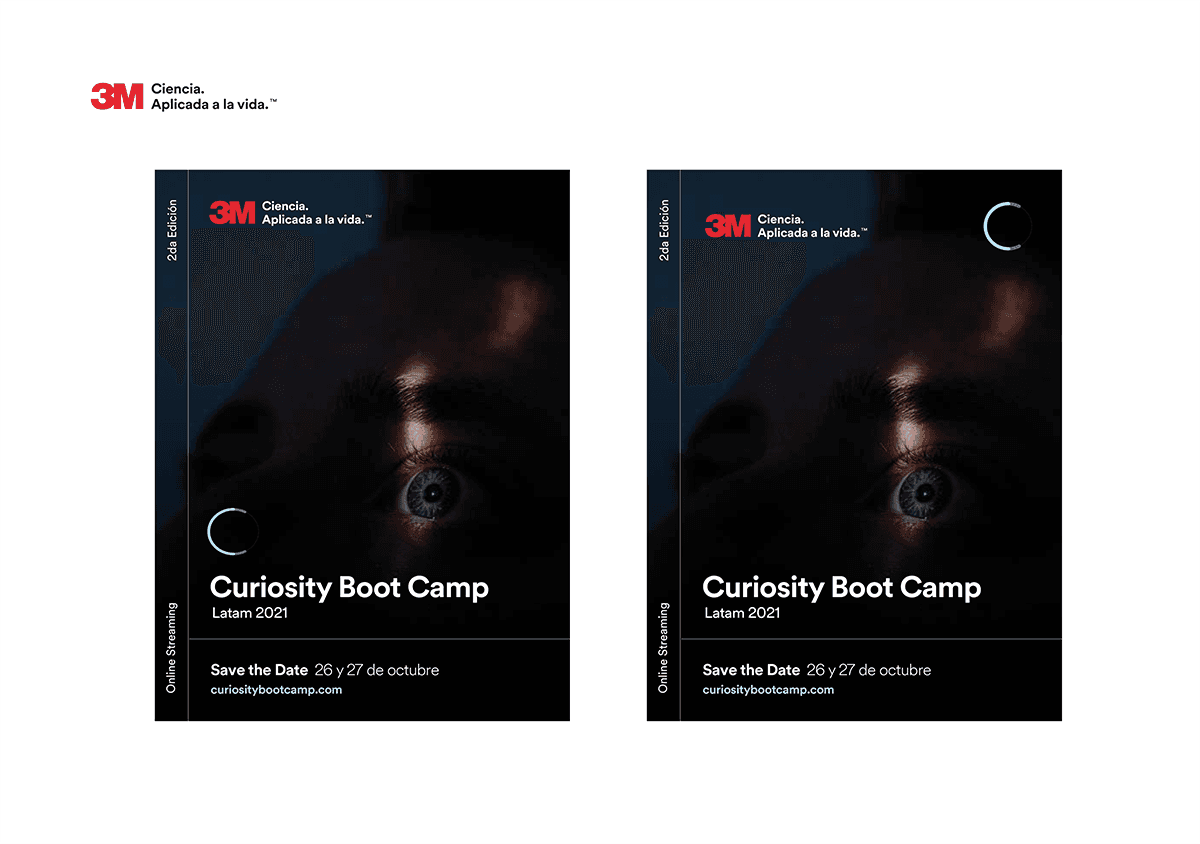
Curiosity as a State
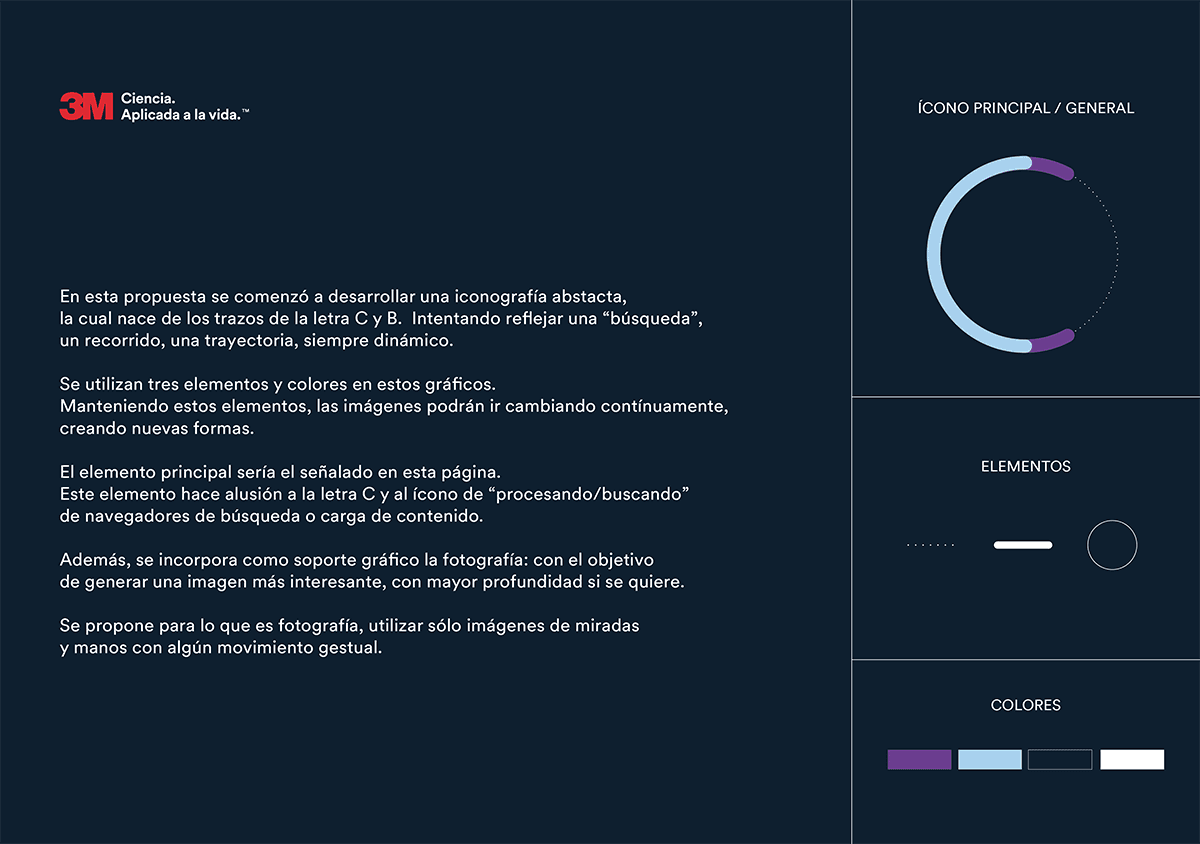
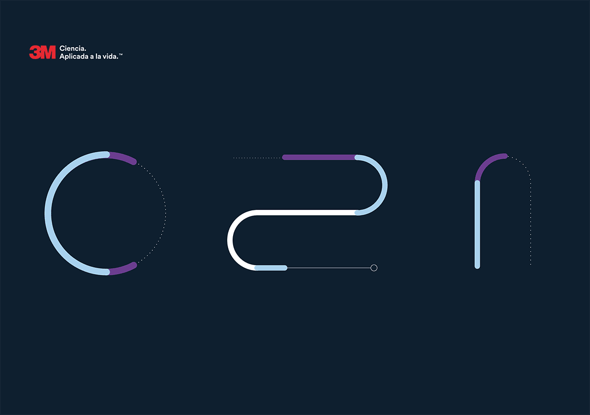
The second direction approached curiosity as a state rather than a character.
Built around an unfinished "C" shape, the visual system referenced both the word Curiosity and the loading indicators found in digital interfaces.
The symbol never fully closes. It remains active.
• Searching.
• Processing.
• Loading.
Supporting photography focused on hands and gazes suspended between uncertainty and discovery, reinforcing the idea of curiosity as an ongoing process.
Of the three directions, this was probably the concept I felt most connected to.
Curiosity wasn't represented as a person.
It was represented as a system constantly searching for what comes next.


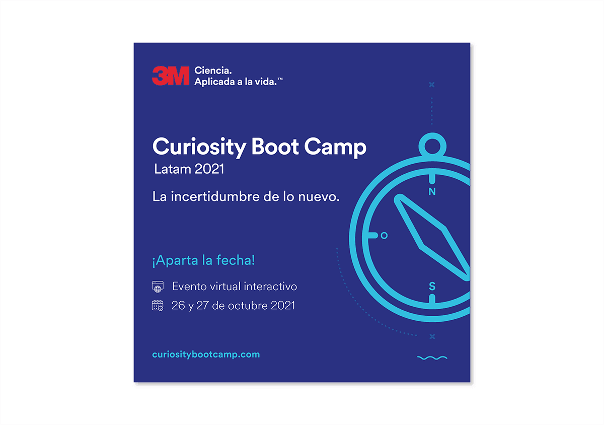
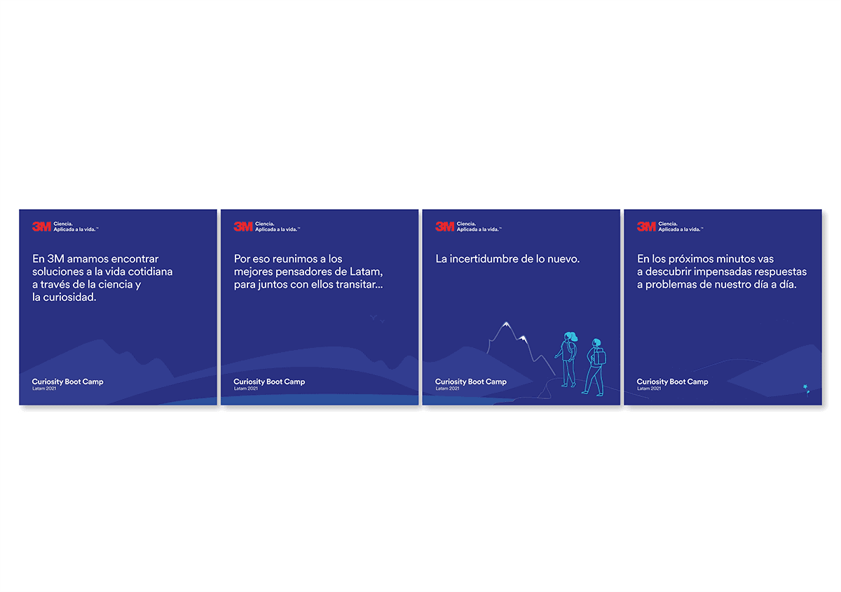
Curiosity as Direction
The third direction approached curiosity as a compass — a tool for navigating uncertainty rather than a symbol or a character.
Unlike the previous two concepts, this one anchored the identity in a recognizable object. The compass gave the system something literal to hold onto — familiar, functional, easy to read across formats.
Where the first two had a clear visual argument, this one expanded the idea into a broader system: different ways of being curious, different profiles, different relationships with uncertainty. The goal was a language people could identify with in more than one way.


What the System Doesn't Decide
Looking back, what interests me most about this project isn't which direction was ultimately selected. It's realizing how much space existed inside the system.
• The logo never changed.
• The guidelines never changed.
• The constraints never changed.
What changed was the interpretation.
• A person.
• A state.
• A direction.
Three different ways of visualizing curiosity.
The system defined the boundaries. The work was figuring out what could happen inside them.